


Today, I want to share how we brought user insights into a design project by walking through the redesign of our platform’s task form. This form is used to capture actions on issues and enables collaboration on what needs to be done.
Why Focus on the Task Form?
To understand where users were experiencing the biggest pain points, I started by reviewing internal feedback submitted through our reporting system. A clear pattern emerged: many of the needs were revolved around the task form. It became evident that this was a key area where we could make impactful improvements.
I wanted to understand the root causes behind these pain points, so I looked at how users currently worked with tasks—what they needed to do and why. This led to setting up a collaborative session with internal users and developers to dive deeper into this.
Understanding the Pain Points
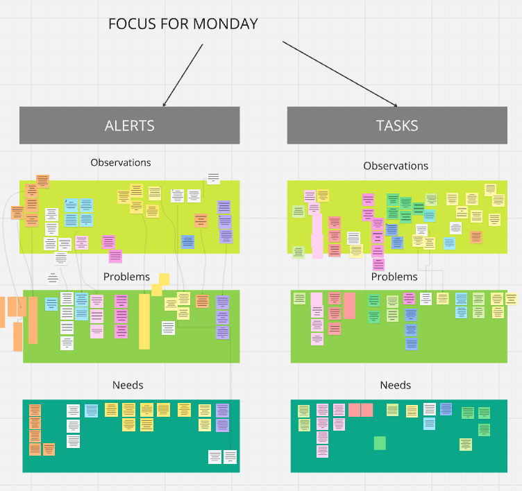
During our workshop, participants listed out their frustrations at every stage. This ranged from raising a task, filling out the form, viewing and collaborating on tasks, receiving notifications, and more. Everyone had time to write these pain points on sticky notes.
Once gathered, we reviewed the notes together, grouped similar ones into clusters, and discussed each in detail. This allowed us to translate surface-level observations into specific problems. At this stage, digging into details using techniques such as the “5 Whys” helped uncover deeper issues and ensured we fully understood the problems which needed solving. You can find out more on 5 why technique on this post by Atlassian.
'How Might We?' statement
Each problem was then paired with a need statement, framed as a “How might we…” question. See an example below:
Observation:
Users often abandon the task form halfway through because it feels too long and overwhelming.
Problem:
The task form is too dense and not intuitive, causing users to drop off before submitting.
Need Statement:
Users need a way to complete the task form without feeling overwhelmed or lost.
How Might We Statement:
How might we simplify the task form experience in order to help users complete it more easily and with less friction and fewer mistakes ?
This ‘How might we’ opens the door to ideas like:
- Breaking the form into steps
- Prioritising fields
- Using collapsible sections
- Adding visual progress indicators
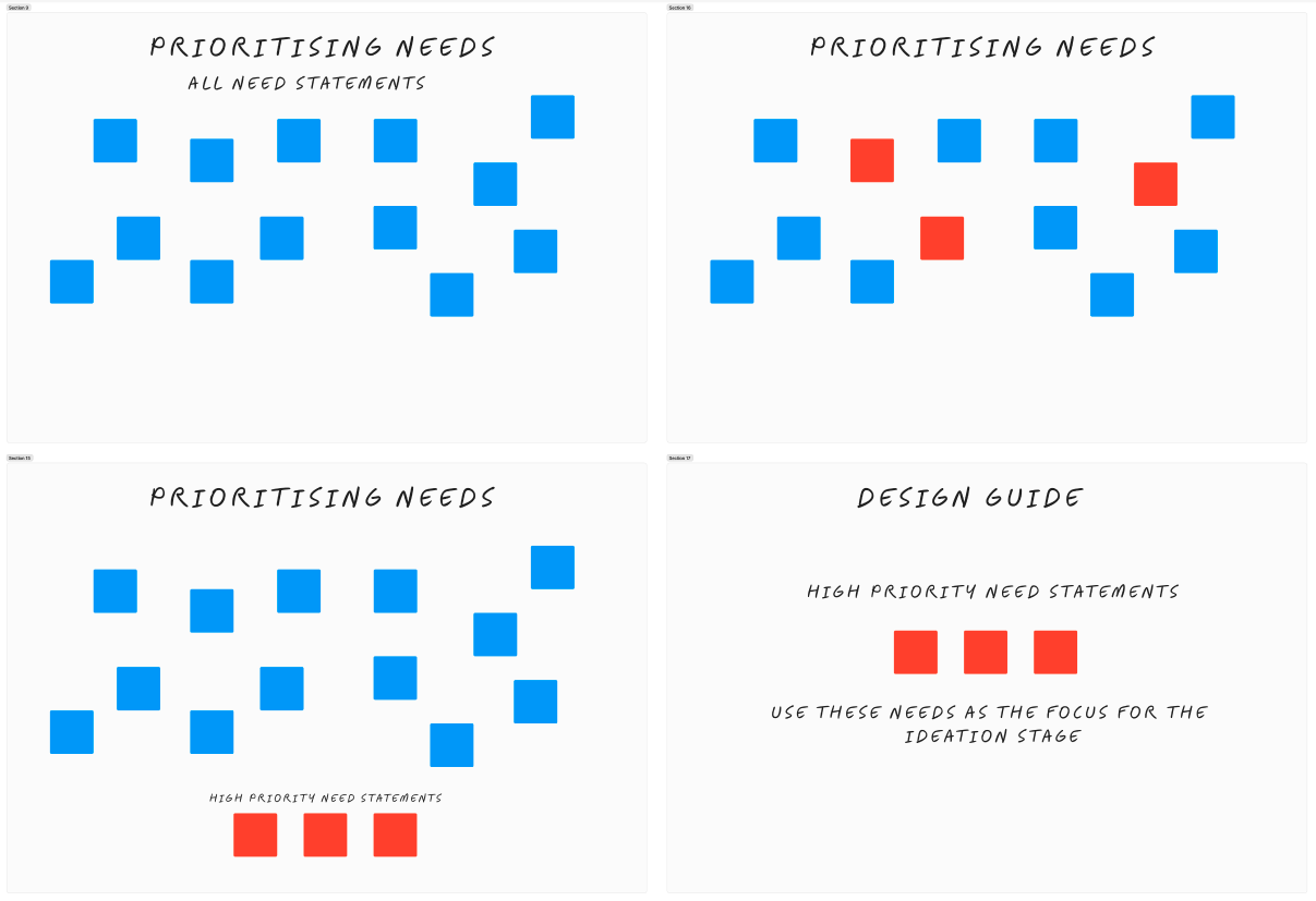
Clustering and Prioritising Needs
We grouped the needs into themes. Some focused on navigation and collaboration within the form, others on viewing and filtering tasks, or understanding task history. Most of the high-priority needs clustered around the task form itself, so we decided to focus our ideation efforts there.
Key Needs Identified
Some of the top priorities for redesigning the task form were:
- Make it clear which fields are most important to fill in
- Improve usability to make the form more intuitive
- Remove redundant fields to reduce time and cognitive load
- Keep only essential information to avoid clutter
- Support storytelling by helping users clearly communicate findings and recommended actions
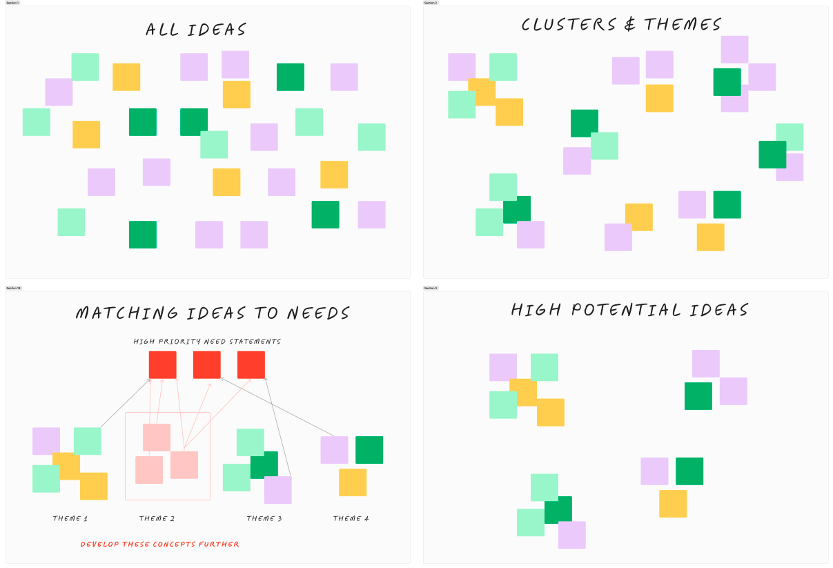
Ideation and Quick Wins
We ran group ideation sessions to generate ideas. Some ideas were simple and actionable in the short term, while others would take more time to implement. We created a roadmap that allowed us to deliver early improvements while planning for larger changes in future iterations.
Initial improvements included:
- Removing non-essential fields to shorten the form
- Renaming fields to improve clarity
- Adding helpful tooltips
- Reordering sections logically and separating them clearly
- Making critical fields mandatory
These early changes already addressed several user pain points and laid the foundation for more significant redesign work.
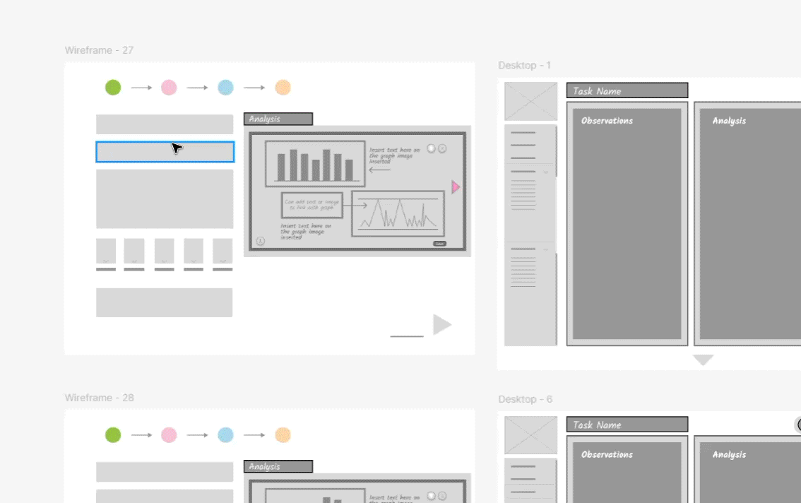
Evolving the Design: Supporting Storytelling
In the next phase, we focused on how users actually use the task form—what they’re trying to achieve. One of the biggest insights was that users weren’t just logging issues; they were telling stories about alerts and recommending actions to resolve them.
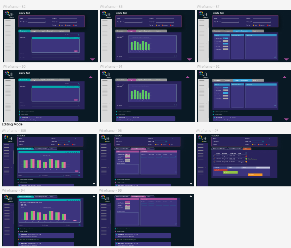
With that in mind, the task form evolved into something more structured and narrative-driven:
- Tabbed sections made the form feel shorter and easier to navigate
- Markdown support allowed for formatted text, bullet points, and images
- Persistent key fields at the top ensured essential information was always visible
- View vs. Edit mode made it easier to read tasks without accidentally changing them
Iteration and Feedback
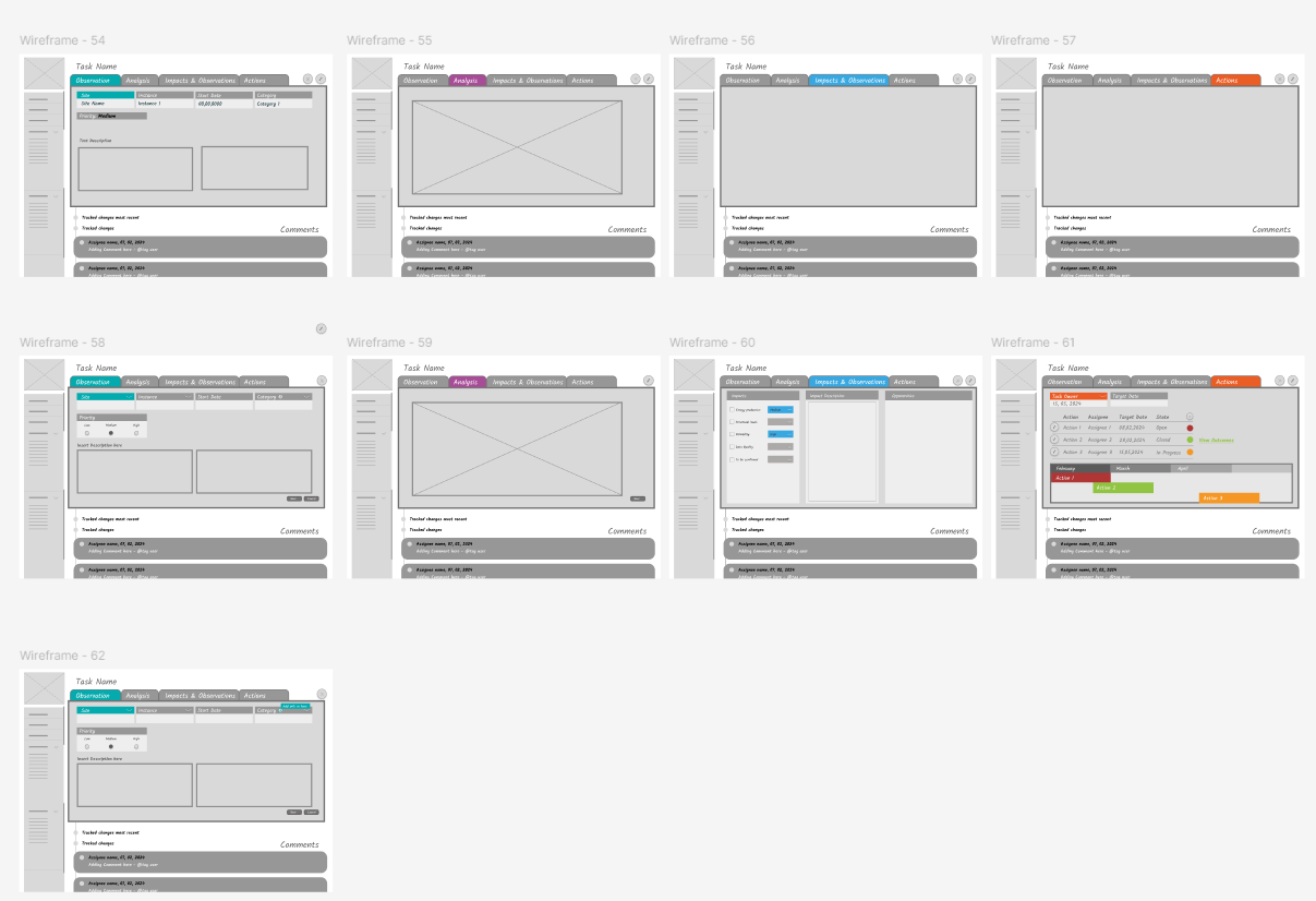
High-Fidelity Wireframes
We began with sketches, moved to higher-fidelity wireframes, and then created interactive prototypes to show how the new task form would work. Throughout, we regularly demoed to users, gathered feedback, tested workflows and interactions and iterated further. The final design reflected a deep understanding of user needs and a thoughtful balance between structure and flexibility.
The Result
Final Design
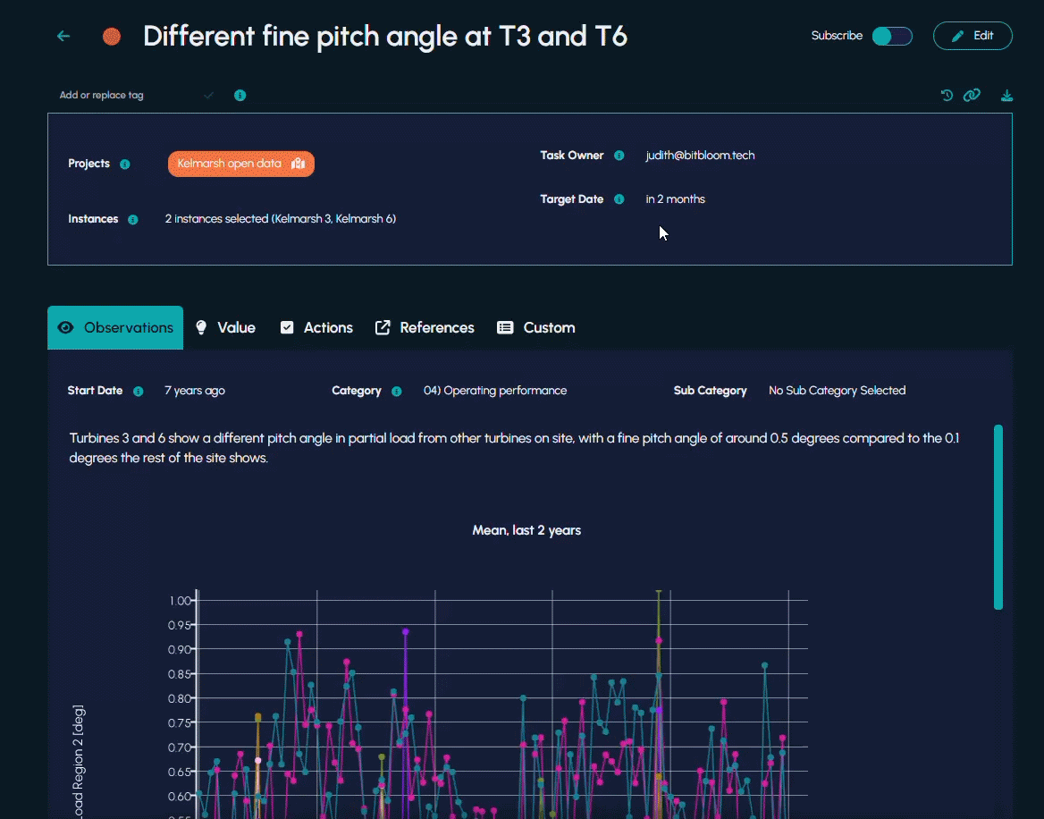
The final redesign significantly optimised how users interacted with the task form- improving their overall experience. It now better supports storytelling, reduces cognitive load, and helps users communicate findings and actions clearly.
Across our customers we’re seeing increased adoption, better clarity and improved communication. These improvements result inhappier teams and renewable assets that run better and generate more value.

Find out more
Are you interested in finding out how Bitbloom’s software – built with our user-centric philosophy – can help your team turn data into value? Get in touch now to find out more.